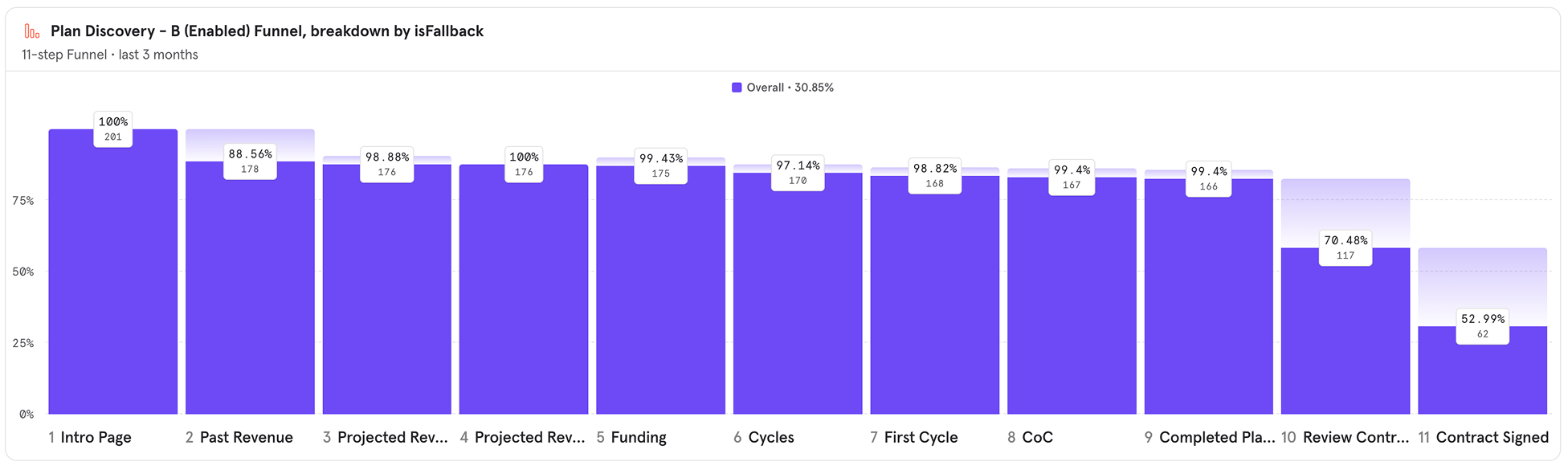
Directed the UX team through a research-driven redesign of funding discovery, increasing contract views by 42%.
Context
The Problem
8fig, a fintech startup offering funding and financial tools for e-commerce businesses, faced a key challenge: not enough users were viewing the contract for their funding offers, limiting conversion.
My Role
Hypothesis
Possible reasons why users aren’t viewing the contract:
- Offer Quality: The amount or conditions may not be suitable.
- Competitiveness: The offer might be too expensive.
- Value Perception: Users may struggle to understand the offer’s benefits.
- Lack of Clarity: The plan may not be clear enough.
Research
How does the current experience look like?
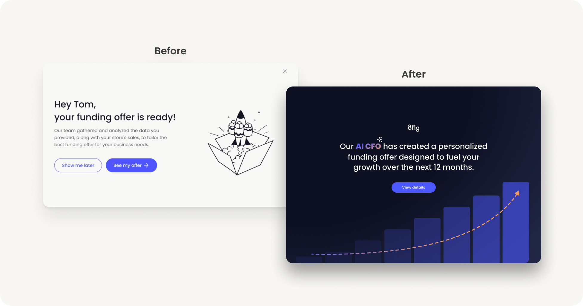
The current experience only highlights the plan’s metrics without explaining why they benefit the user. To address this, we conducted in-depth feedback sessions with users.
Users feedback sessions
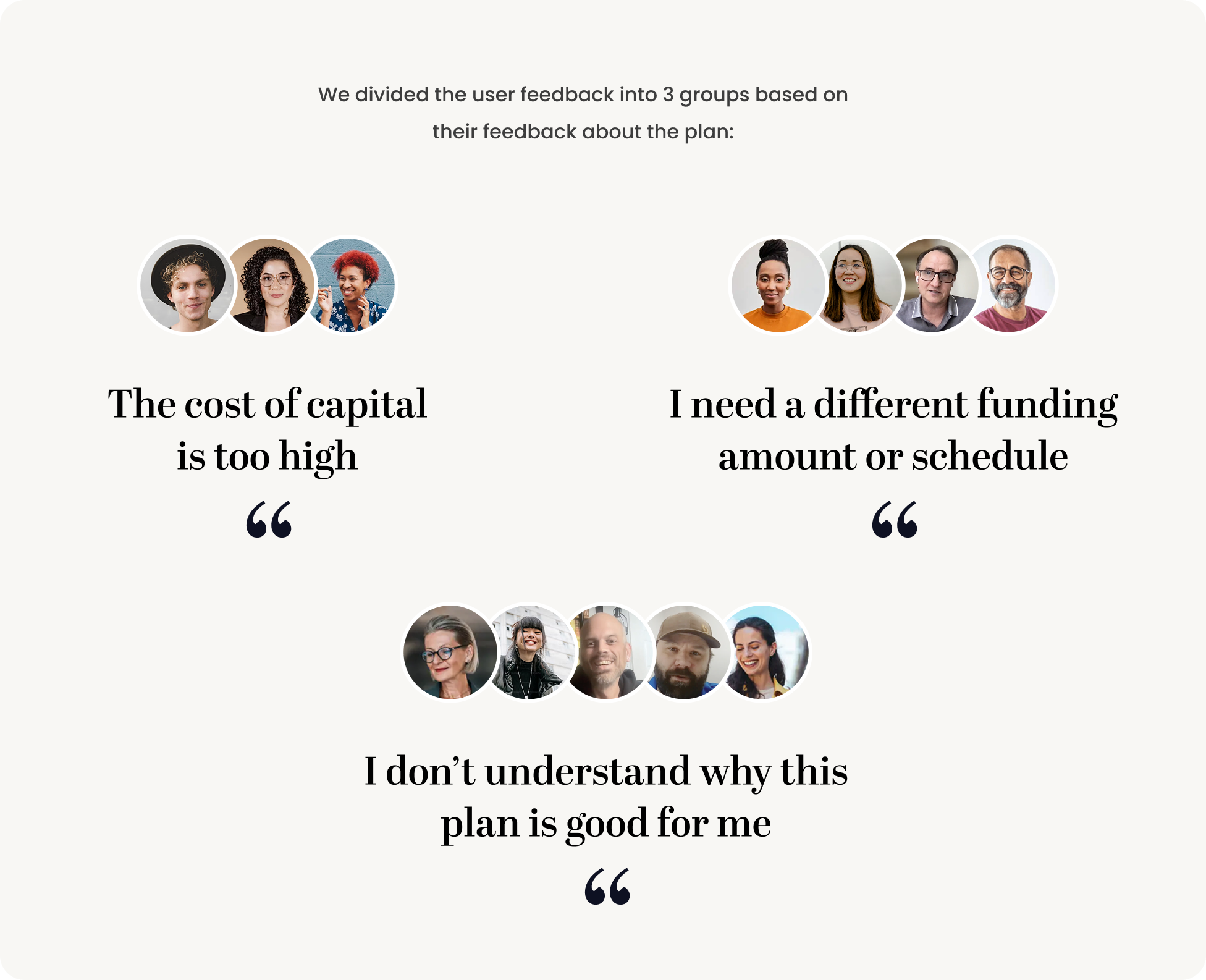
Feedback insights conclusions
Users struggle with the plan’s parameters, but due to business algorithms and risk assessment, changes aren’t possible. They also lack clarity on how the funding plan is calculated or why it’s valuable. To address this, we improved discovery with better messaging, experience, and education to ensure users understand the plan’s reasoning and benefits upon approval.
Design Process
UX and messaging strategy
- Create trust
- Create transparency
- Provide reasoning for the parameters of the plan
- Position 8fig as growth partners- “we are on your side”
- Surface the value of the plan
Final Design
The final design prototype: a new discovery feature! Once the user’s plan is ready he would be redirected to the following experience to get educated about the funding plan:
Design decisions & main screens- step by step
- Simplified Flow: Divided into three main steps for clarity.
- Dark Mode: Emphasized data, graphs, and education to build trust.
- Design System: Optimized existing components for faster development.
- Animation: Illustrated connections between plan parameters.
- Visual Continuity: Reused components to prepare users for the next step.
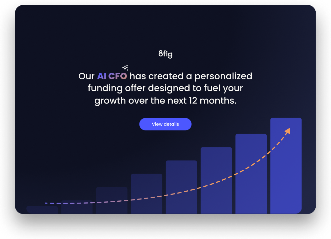
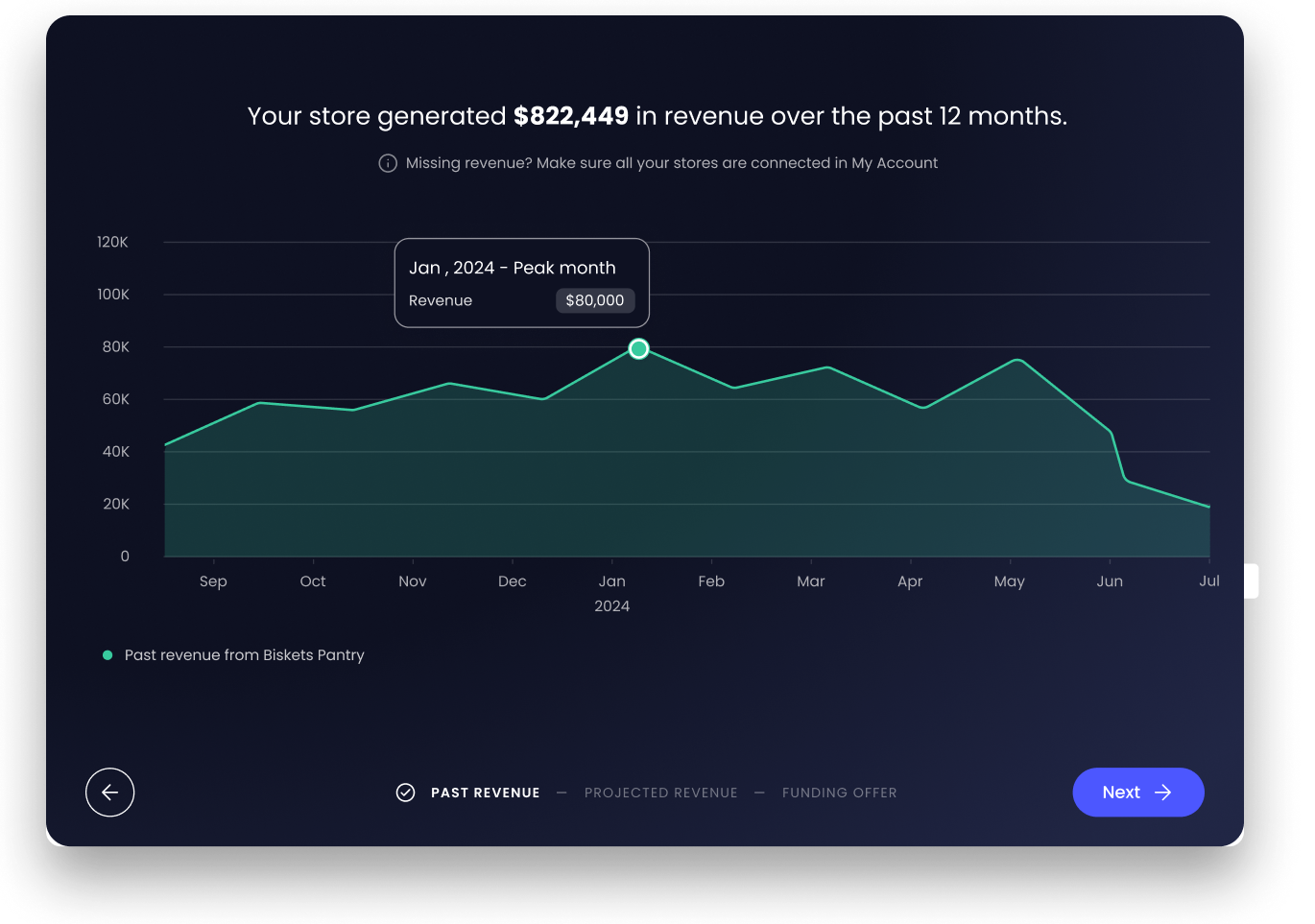
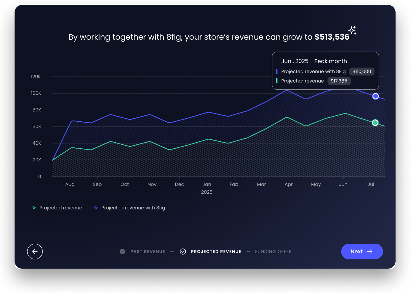
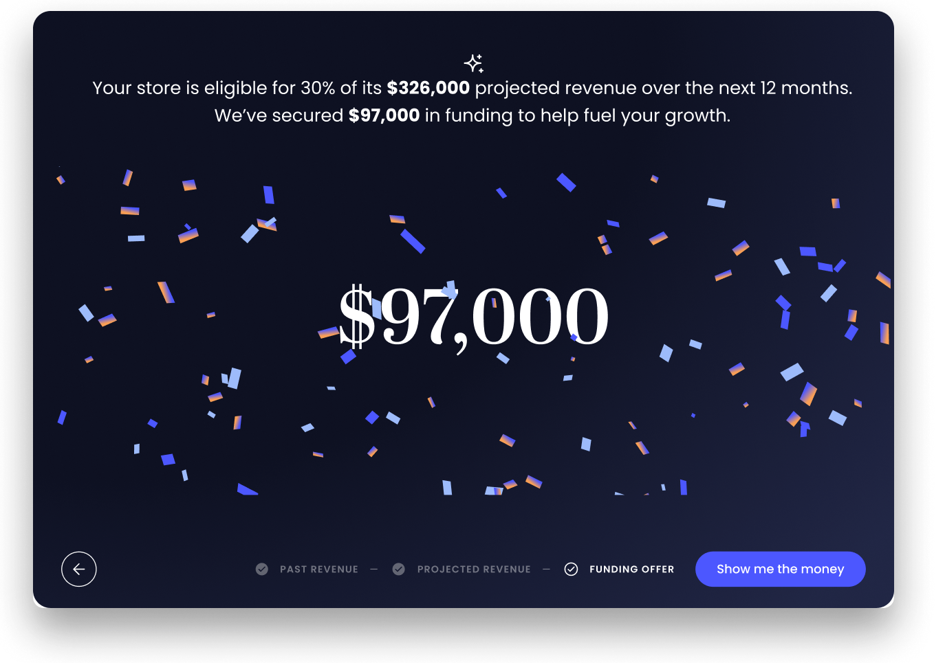
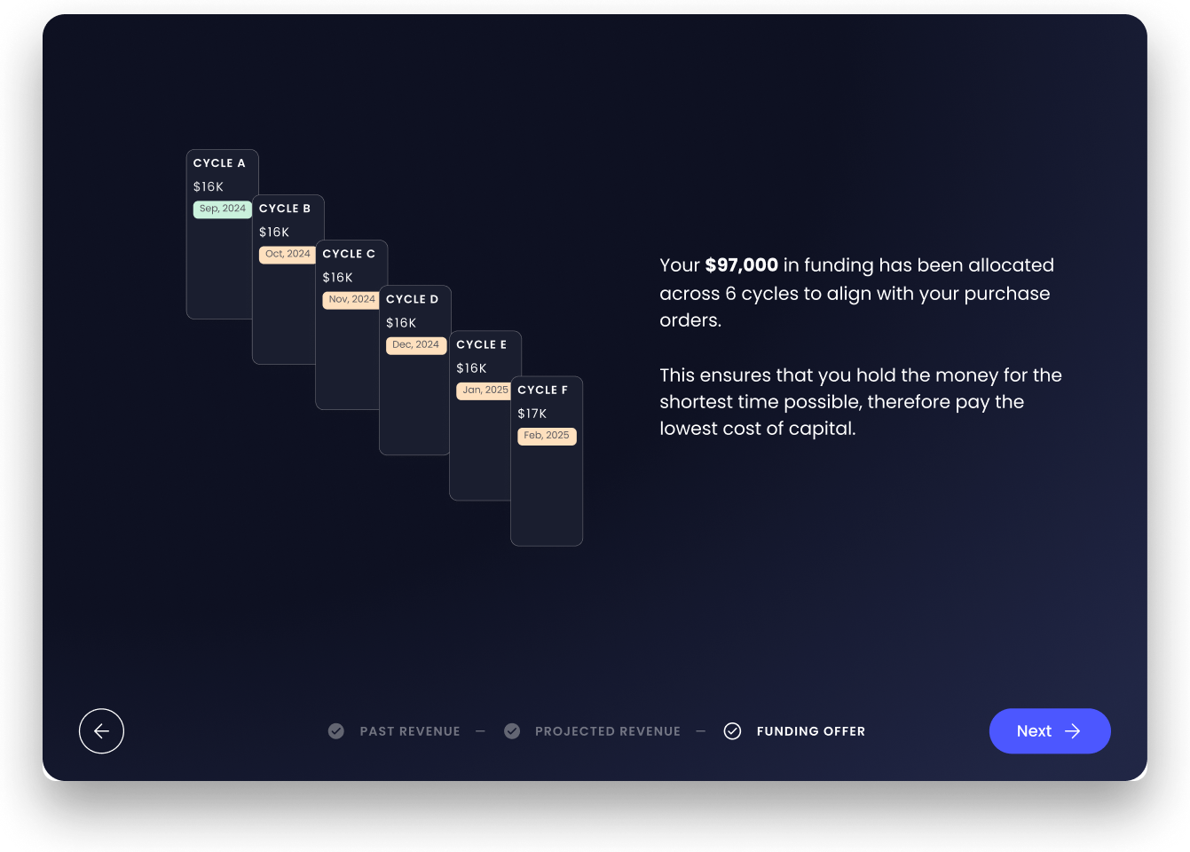
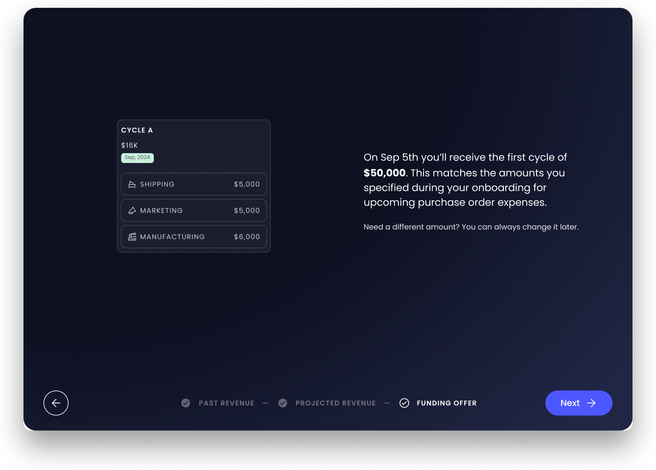
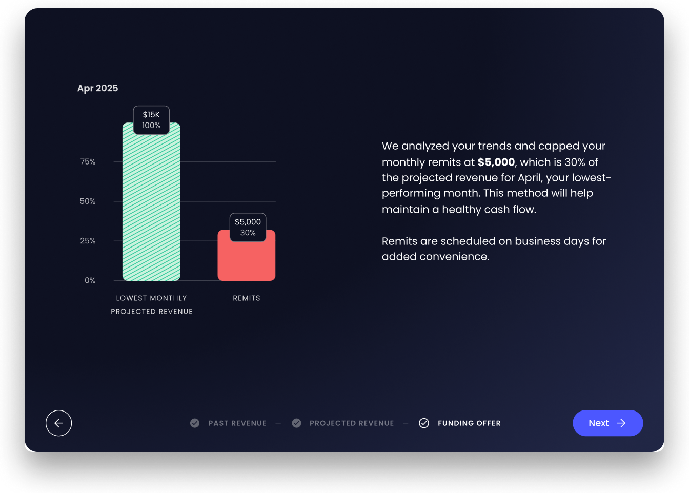
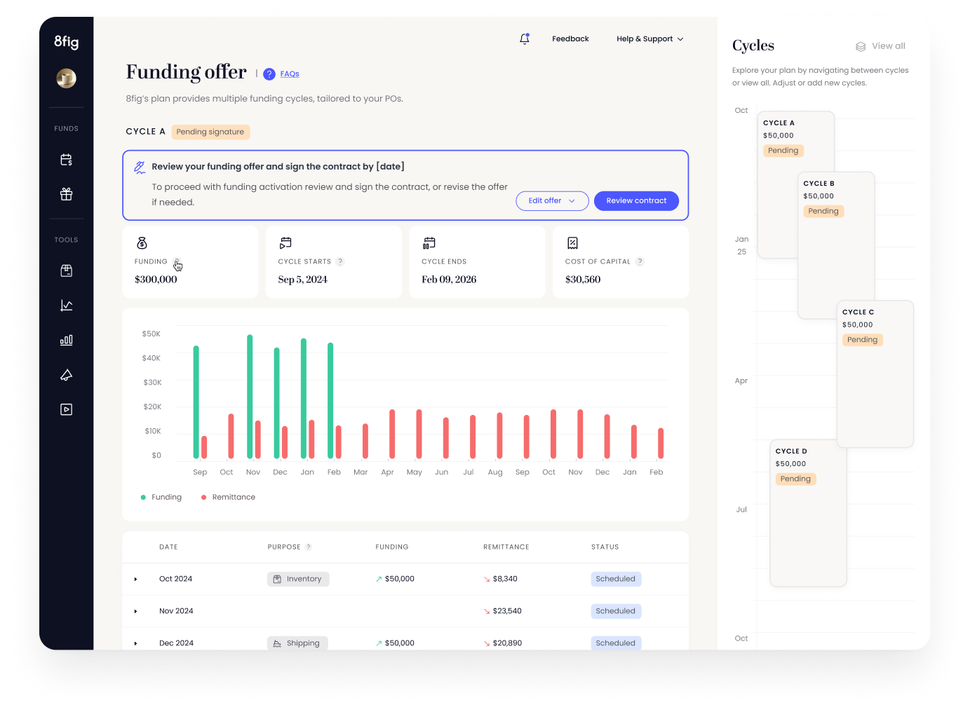
Once a user receives a funding plan, they’re sent an email directing them to the funding offer page, where they are guided through the following flow.
Build Trust: Showcase insights about the user’s company.
Highlight Value: Explain how the funding plan enhances growth potential.
Transparency: Show how the funding amount is calculated based on projected revenue.
Engagement: Create a celebratory moment to enhance user experience.
Show how cycle-based breakdown benefits the user and aligns with their initial onboarding request.
Highlight how we ensure a healthy cash flow balance throughout the plan.
At the end of the Discovery flow, the user is redirected to the plan and can proceed to review the contract.
Data results
Achieved a 42% increase in the number of users reviewing their funding contract, indicating improved engagement and trust.
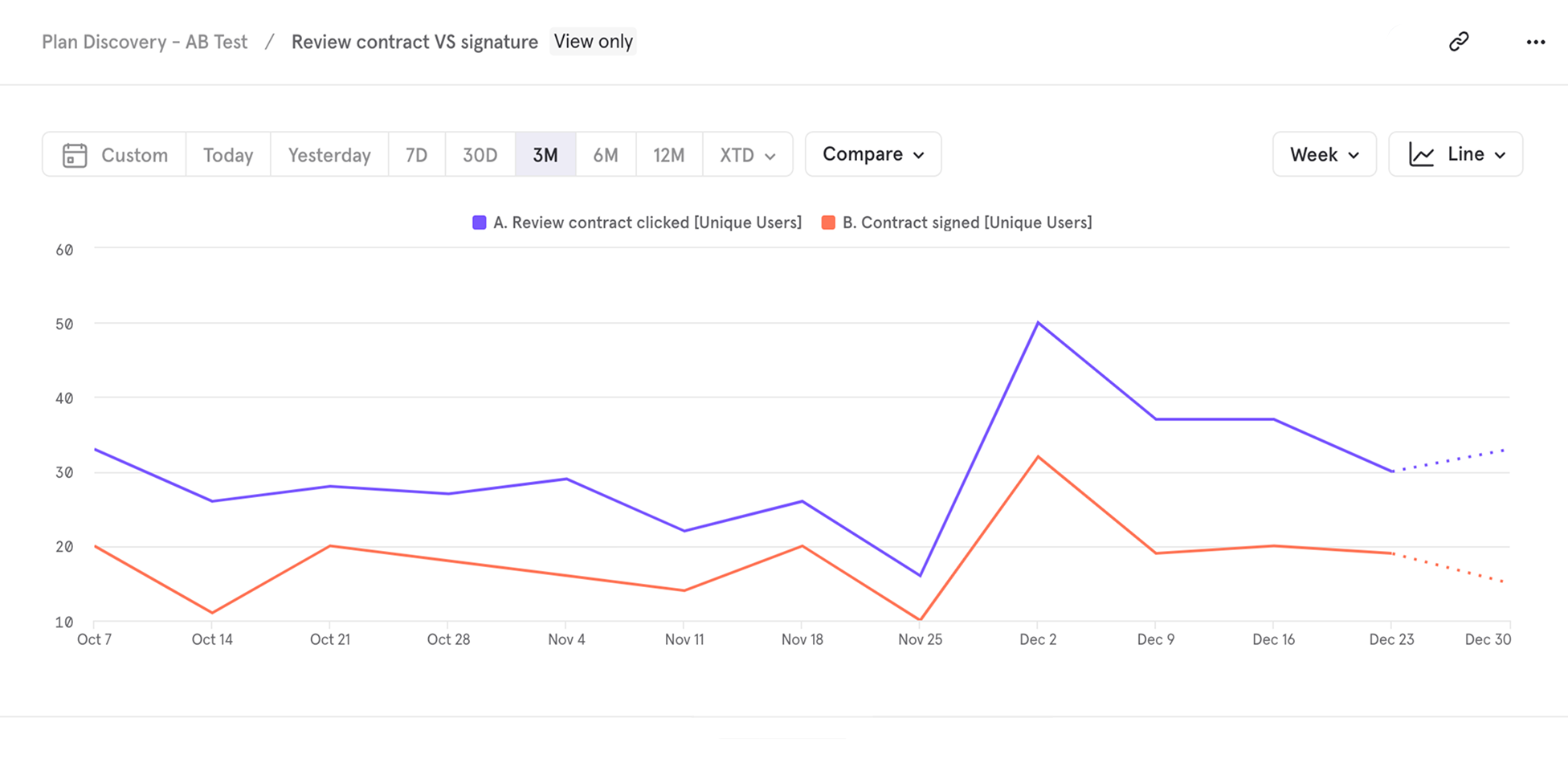
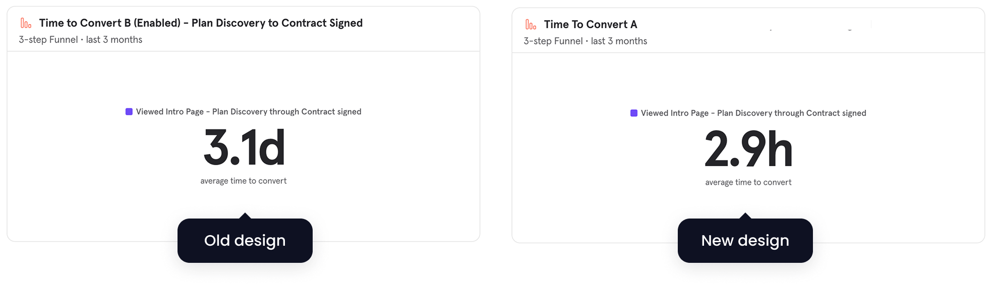
Reduced time to conversion from 3.1 days to just 2.9 hours
70% of users who went through the discovery clicked on “review contract” (compare to 55% before)